
- June 8, 2026
- Categories: Web Solutions
Why Mobile-First Website Development Matters More Than Ever
Have you ever thought about why users click on your site but don’t stay for long? This is what happens when you don’t have a mobile first website development.
Mobile first website means that you have to build your site to be easy to use on all small screens. When you set site for smartphones, you can fix it according to desktops and tablets.
You might have noticed that in today’s world, everyone spends most of their time on mobile phones. You will explore in research that 77% of online activity in the UK now takes place through smartphones in 2025. If you go deeper, you will see that people spend almost 4 hours online each day on mobile devices.
Some companies still design their sites for desktop. However, it’s better if you don’t follow this rule because it will totally change conversions, client trust and engagement.
If you are a business owner and you first opt for mobile website development, your firm will perform better. For example, you will be doing better in retention, traffic and SEO. You can keep readers engaged, encourage action and build lasting trust. This is possible if you have focused on mobile website development.
In this blog, you will learn the value of mobile website development and how it affects SEO and performance. You will also discover what you can do to remain competitive.
Key Takeaways:
- A mobile-first website helps users get a faster, clearer, and smoother experience on phones, which can improve trust, engagement, and sales
- Mobile website development should focus on speed, touch-friendly design, simple navigation, and clear content for smaller screens first
- Mobile-friendly website development works across devices, but it may not give the same strong mobile experience as a mobile-first approach
- The best mobile-first websites use clean layouts, quick-loading pages, and easy actions that help users stay longer and convert more often
- Learning how to build a mobile-first website means starting with mobile layouts, testing on real devices, and improving performance over time
- Understanding what a mobile-first website is and why it’s key, because it means designing for smartphones first and then scaling up for tablets and desktops
What Is Mobile First Website?
A site is called mobile first website if you design it by keeping in mind the small screens first. Once you build your site for smartphones, it is then adapted for larger devices, like desktops.
Today, you will notice that the coders focus on mobile friendly website development from the very early stages. It will be a wrong choice if you create a full desktop site and then shrink it to small screens.
This strategy will ensure that features, vital content and navigation are fully optimised for smartphone users.
Thus, first you have to build your site for the device that most people use. Mobile website development is not only about creating a mobile friendly layout. It also involves improving speed, navigation, clarity and the overall user experience. It includes:
- Smooth user experience
- Simple design and quick loading speed
- Using a touch system for interaction
- Clear and arranged content layout
- A simpler way to navigate through small screens
- Accuracy on slower networks
Design is not just what it looks like and feels like. Design is how it works.
Steve Jobs, Co-founder of Apple
Why Mobile First Website Matters?
Due to the huge increase in smartphone internet usage, it has become vital that you create a mobile first website. In today’s era, small screens attract most of the site traffic all over the world. This method has ruled certain business sectors.
Now, everyone is using most of their time on smartphones for almost every purpose. For example, they check it for shopping, news, social media and services. Roughly nine out of ten web users use mobile phones to access the internet.
Mobile traffic has risen a lot in many regions. Users who use this device mostly control sectors such as local services, travel and commerce. Between firms and people, this trend has made the mobile phone the first point of contact.
At times, your first impression happens through your mobile phone. If a visitor finds the mobile service poor, you will quickly ruin loyalty and trust.
There are more chances for visitors to leave quickly if your site is slow to load, difficult to access or busy on mobile. In such a case, users move on to a competitor.
If you do a competitor analysis, it shows that firms with mobile first websites draw in far more traffic. They also persist in keeping users for longer sessions.
You must also be aware that a mobile first website gives a more natural, faster and smoother experience. This offers firms a clear benefit in today’s highly competitive online sector.
Did you know?
Around nine out of ten internet users now access the web through mobile devices. For many people, a smartphone is the first place they interact with a business online.
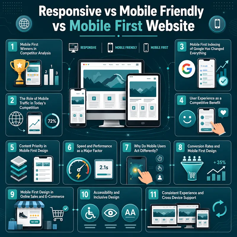
Responsive vs Mobile Friendly vs Mobile First Website
When you compare all these ways, it is easy to see why mobile first websites do better than the others. With the help of this analysis, you will know how each design treats mobile users.
You will also grasp from this contrast what truly drives conversions, engagement and speed.
Mobile first design begins with smaller screens. So, if you are a business owner, you will also need versatile designs that work on many devices. Thus, it’s good that you know the responsive web design essentials, which will help you create a seamless user journey.
| Design strategy | How it begins | Main focus | Mobile experience | Notes |
|---|---|---|---|---|
| Mobile first | Mobile design first | Key details, ease of use and speed | Ideal for mobile users from the start | Grows to tablets and PCs |
| Responsive | Desktop design first | Layout for smaller screens | Adaptable but may include PC focused elements that impact mobile performance | Focus on adjusting rather than assigning priority |
| Mobile friendly | Usually upgraded from a desktop version | Works on mobile, but optimisation is limited | Can seem slower or less natural | Not made specific for mobile users |
Why Mobile First Website Development Gives Competitive Benefit?
You need to know why mobile first websites often perform better than their competitors.
Knowing the key factors behind their success can help you stay competitive in today’s online world.
They are explained below:
1. Mobile First Winners in Competitor Analysis
When you analyse all the sites deeply across the different fields, you will see a clear pattern. You must analyse the competitors and see why web pages built with a mobile first plan often beat others.
If you build a site with a mobile first plan, it is more likely to have better search reach and drive higher engagement. You will find that it has a low bounce rate and higher client satisfaction. The reason is that such sites are built around how people actually behave on mobile phones.
Ideally, you must expect every page to load under three seconds. Each user wants to choose a site that has simple access and easy to scan content. Now, users want a touch system on every site and no one likes clicking. People will leave in no time if the pages seem to them slow or messy.
So, you must build for the sites that qualify for these criteria.
2. The Role of Mobile Traffic in Today’s Competition
Due to the power of mobile traffic, you will see another shape of digital tactics. In almost all sectors, most visits are done through mobile phones.
When you think about shopping online, they begin and end on a smartphone. Now everyone just scrolls on their phones and performs all the activities like researching, comparing and buying.
As a business owner, you will no longer compete only for desktop attention; a major platform for competition is phones.
If the mobile service of your business is poorly optimised and slow, it will not perform better. The one with a clean and fast mobile site will always stand out.
With the help of mobile website development, you will learn that people are loyal from the first interaction. This will be helpful for you in reducing lost chances and early drop-offs.
3. Mobile First Indexing of Google Has Changed Everything
One of the major changes you will explore in modern SEO is the mobile first indexing of Google. Search engines choose the mobile version of the site when they have to index, assess and rank content quality.
If the mobile edition of your site runs poorly, even a fully smooth PC page may rank badly. Competitor websites rank higher and attract more organic traffic for mobile phones. You will see that they also rank well in local searches and have stronger core web vitals.
You must focus on mobile performance for ranking because companies with poor mobile services risk losing to competitors.
4. User Experience as a Competitive Benefit
You must grasp that the user journey is one of the top competitive factors in the current web design.
You can improve UX with mobile first design by focusing on clear content management and easy navigation. You can also consider readability and speed up load times on small screens.
You can keep people engaged for a long time if you focus on a touch friendly layout for your website. On the other hand, if your site has a poor mobile experience, users will leave it quickly.
Research from Google shows that 53% of mobile users exit a site if it takes longer than 3 seconds to load.
Even minor delays on your site will reduce engagement and increase dropout rates. You will never see people coming back to your page if they found a poor mobile experience.
When you analyse your competitors, the ones who have invested in mobile first design are the winners. This is because they have gained lasting benefits in retention and brand trust.
5. Content Priority in Mobile First Design
A mobile first design helps you focus on the most important parts of your website. Phone screens are small, so you need to show the most useful data first.
This includes crucial links, key messages and your main products or services. It also helps you remove things that may distract visitors.
When your site is simple and clear, people can find what they need faster. They can read your message more easily and take action without getting confused.
For small screens, extra content is removed or simplified, which improves clarity and allows visitors to find data quickly. Users are sometimes stressed when the competitor websites fail to prioritise content.
This scenario leads to higher bounce rates and lower engagement. The designs that are mobile first make sure that people are guided smoothly toward the actions firms want them to take.
6. Speed and Performance as a Major Factor
For mobile first development, speed is one of the most key factors. People using smartphones expect pages to load within three seconds and want their chats to go smoothly.
Mobile first websites achieve quicker performance by reducing file sizes, minimising scripts and resizing images. You can also use small sized sites for this purpose.
When the websites are slow, they lose visitors quickly. There is also a strong link between speed and conversion rate in competitor analysis. Competitor analysis often reveals a strong link between speed and conversion rates and slow sites lose users fast.
Performance optimisation is crucial for competitiveness because even small delays can harm sales, engagement and client satisfaction.
7. Why Do Mobile Users Act Differently?
Compared with desktop users, mobile users interact a bit differently. They are often on the go, doing multiple things at once and seeking quick answers. They often use one hand to operate small screens.
As a result, mobile first websites need to be simple, easy to use and quick.
Mobile friendly website development has better return visits, lengthy sessions, lower bounce rates and more engagement.
People can find what they need with a few steps and less friction due to a mobile first design. This method also lowers friction.
8. Conversion Rates and Mobile First Design
Higher conversion rates are one of the main benefits of mobile first creation. Not only do mobile users surf the web, but they also make purchases and book services. They also fill out forms, sign up for newsletters and get in touch with firms.
By making CTAs simple to view and tap and improving navigation, you can increase conversions through a mobile first website. This approach also cuts down on clutter and speeds up page loads.
You can also raise completion rates further by easy checkout steps and appealing layouts. Most notably in the sales and online retail fields, even minor user interface tweaks can lead to visible results.
9. Mobile First Design in Online Sales and E-Commerce
Mobile first layout is a must for the growth of e-commerce. The reason is that people use mobile devices for searching for products, checking prices and reading reviews. They also use it for adding items to the cart and making purchases.
Many people use their mobile phones to finish the entire buying process without using a PC. Simple payments and faster checkout steps are perks for mobile first e-commerce sites, according to competitor analysis.
Through a mobile first strategy for your sites, you can reduce cart loss, better product search and provide clearer navigation.
Even the income of your business is directly impacted by mobile optimisation. This is because more seamless mobile shopping allows clients to finish orders rather than remove their carts.
10. Accessibility and Inclusive Design
You can enhance ease of access naturally by mobile first design. This way, sites are open for all audiences, including those with disabilities or older devices. All this is possible due to wider buttons, readable fonts, strong background contrast and clear layouts.
Mobile first sites are often built to support screen readers and voice browsing. Companies that don’t focus on ease of use may lose most of their audience. Mobile first designs that are more friendly build trust and improve user satisfaction.
11. Consistent Experience and Cross-Device Support
These days, people often switch between devices. They may use tablets or phones to buy something, PCs to compare options and mobile devices to find a brand.
With the help of mobile first design, you can make sure that layouts grow smoothly and content remains readable. It also ensures that navigation stays uniform and performance is stable on all platforms.
According to competitor analysis, firms that offer a seamless multi device experience increase customer trust and return rates. However, a site that works well on one device but poorly on another causes friction.
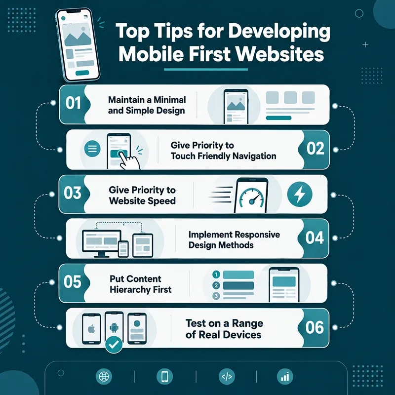
Top Tips for Developing Mobile First Websites
For mobile friendly website development, stick to some basic rules that ensure ease of use and performance.1. Maintain a Minimal and Simple Design
Clear and simple designs are most ideal for mobile first websites. People can carry out duties more smoothly and easily when they focus on clarity.
A seamless user journey is created by clear messaging and minimal clutter. You can also achieve this through clean layouts and a clear content structure. This ease of use means that visitors can find what they need without any trouble. They also navigate the site with ease.
2. Give Priority to Touch-Friendly Navigation
Navigation needs to be touch friendly because mobile users mostly operate with their fingers. You must keep proper space between interactive elements. Besides this, make your buttons large enough to be tapped easily.
To allow people to navigate the site naturally, menus should be clear and made to match thumb position. More lengthy visits are promoted and stress is decreased with careful and simple navigation.
3. Give Priority to Website Speed
Speed is an important part of making sure that mobile first sites work at their best. Users demand quick loading times for webpages. If they find slow loading, it will affect interaction levels and conversion rates badly.
Mobile first sites ensure quick performance by reducing large files and removing unused scripts. A speedy site always wins over its slower competitors in engagement, retention and conversion.
Mobile users require sites to load promptly. This is why improving website loading speed and conversions should be a vital component of any mobile first plan.
4. Implement Responsive Design Methods
Mobile first design starts on a phone but uses responsive methods to deal with all the other screen sizes.
You can make your site useful on mobile screens and PCs, with the use of flexible grids and scalable images. You can also use CSS media queries and a fluid layout for this purpose.
5. Put Content Hierarchy First
An effective mobile first website arranges content in a way that key data comes at the start. These sites give priority to key messages and put CTAs where they are easy to see. They also keep secondary data organised.
A logical content hierarchy stops viewers from feeling stressed out. This makes it possible for them to swiftly surf the site and naturally directs them towards the best actions.
6. Test on a Range of Real Devices
To verify the practical ease of use, tests on various devices are a must. Perform tests on the web page for a variety of smartphones, for multiple sizes of screens and different networks.
This will help with finding out if there are any issues. It will ensure the seamless use of the web pages by all users.
What Are the Common Mistakes Firms Make in Mobile First Websites?
Many firms continue to lose to competitors due to errors in mobile design that could be avoided.
These comprise:
- Blocking mobile screens with desktop pop-ups
- Too many pages with huge images or videos
- Ignoring a mobile performance test
- Keeping vital data hidden on mobile versions
- Using complex navigation systems that are unfit for touch
- Not making the critical changes for slow mobile networks
What to Avoid!
Heavy videos, desktop pop-ups, slow-loading pages and complex menus can quickly drive mobile users away. Even small mobile usability issues may reduce trust and conversions.
What Are the Steps to Create Best Mobile First Websites?
Firms usually use a systematic strategy to create the best mobile first websites. These include:- Start by looking at audience needs and user actions
- Outline the basic steps users should take on mobile
- Make mobile designs first
- Create easy structures with clear access
- Use clean code and modern systems
- Optimise images and media for quicker performance
- Make sure it is easily read and accessible
- Use real devices to test performance
- Improve according to analytics and user feedback
How Does Mobile First Website Design Support Future Proofing?
Long-term reliability is one of the major benefits of mobile first design.
Mobile first websites are simpler to adjust to:
- Future surfing tools
- Tablets and hybrid screens
- Wearables
- Foldable devices
- New mobile phone sizes
This is the reason that this strategy is effective and cheap for firms aiming to stay competitive over time.
Case Study: Mobile First Website Improved E-Commerce Quality
Helmet City is a famous motorcycle helmet and spare parts company in the UK. It has five on-site stores across southern England.
One of their sites was running on an old version plugin heavy theme. Its loading speed was very slow and it gave users a poor browsing experience.
When the performance issues were identified, the firm moved to the Hyva mobile first repair process. This system was made with a user friendly design specific to how motorcycle shoppers search and buy over the internet.
The results were highly significant. Helmet City noticed a 16% growth in the conversion rate within four weeks of its initial release. It was also recorded that the engagement rate rose 21% and the page load times were reduced by 4 seconds.
The store was able to maximise its sales via better product discovery, a quicker site and easier navigation.
Later, this programme turned into an ongoing conversion optimisation strategy. This includes smarter search functions and improved e-commerce traits. This results in an extra 9% boost in sales and 5% turnover growth.
This case study helps us figure out that mobile first website creation is not simply about mobile support. When you merge it with UX and performance optimisation, you can create visible gains in interaction and conversion. You can also achieve lasting business growth.
Final Thoughts
In the modern online world, best mobile first websites are not just an option but a necessity to stay competitive. The firms that opt for mobile platforms often see better engagement, conversions and client loyalty.
Xoom Plus knows the value of mobile first design. It has altered its web visibility to offer a quick, simple and useful service for its customers.
You can ensure your business stays user friendly, visible and ready for the future if you invest in a mobile first site.
Reach out to us now to get started if you are ready to upgrade your online experience.
Struggling with a slow website that loses mobile visitors?
We build fast, mobile-first websites that improve speed, usability, and online performance.
Trusted to support growing businesses with stronger digital experiences, we have helped with mobile-first website projects and performance-focused web solutions.
Contact us today!
FAQs
What is a mobile first website?
A mobile first website is designed for smartphones and small screens before desktops and tablets. It focuses on speed, simple navigation, and smooth user experience. This approach helps websites perform better across all devices.
How to build a mobile first website?
To build a mobile first website, begin with small screen layouts and key content first. Use responsive design, touch-friendly navigation, and compressed media. Test the site on real devices to ensure speed and usability.
When did mobile first web design start?
Mobile first web design became popular around 2010 as smartphone usage increased. Designers began creating websites for smaller screens before desktops. This approach grew further as mobile internet traffic continued to rise.
Does Google index mobile first website?
Google uses mobile first indexing for ranking and indexing websites. This means Google mainly reviews the mobile version of a website. A strong mobile experience can support visibility and search performance.
Which are the best mobile first websites?
The best mobile first websites are fast, easy to navigate, and designed for smaller screens. They offer clear content, touch-friendly layouts, and quick loading times. Top-performing e-commerce, service, and media websites often follow this approach.