
- April 24, 2026
- Categories: Web Solutions
Why Responsive Web Design Is Essential for Your Website in 2026
Key Takeaways
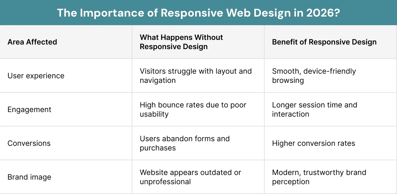
- Responsive web design is no longer optional in 2026, as users expect seamless performance across all devices and poor experiences can lead to lost traffic, engagement and conversions
- A mobile first approach is essential because it prioritises key content, improves loading speed and ensures usability for the majority of users who access websites via smartphones
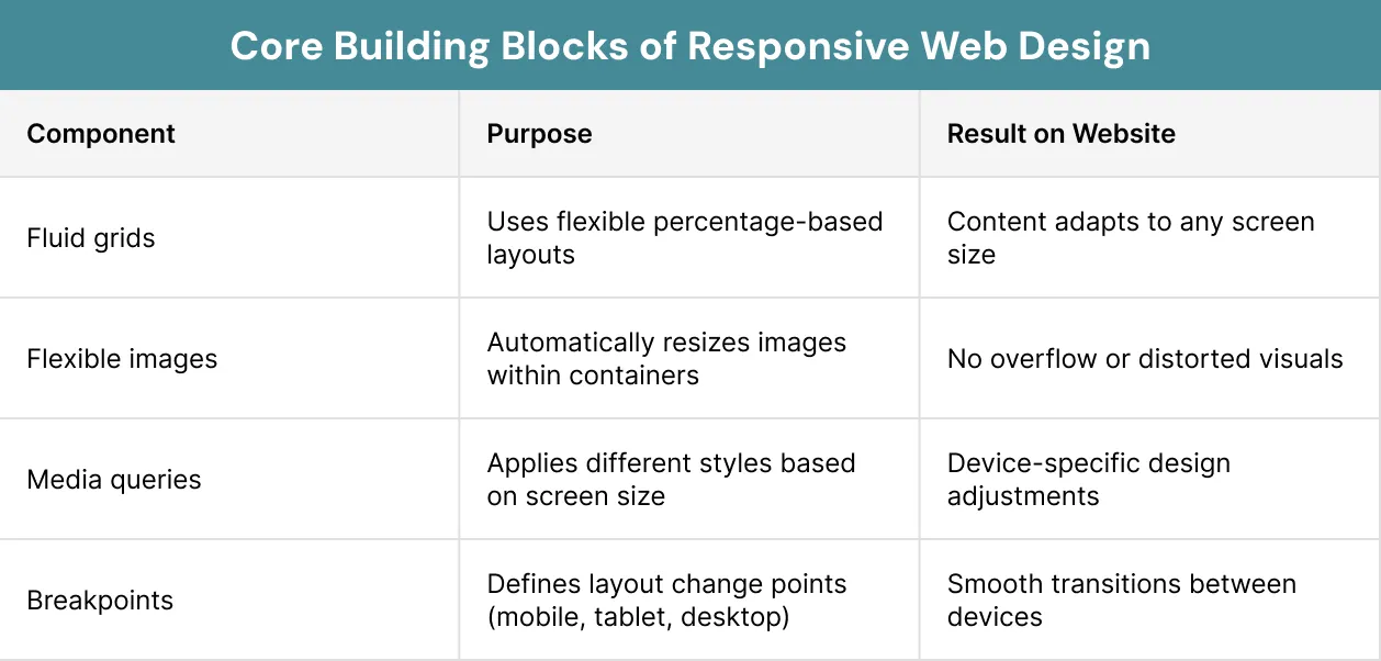
- Effective responsive web design relies on core techniques like fluid grids, flexible images and media queries to automatically adapt layouts to different screen sizes
- Website performance must be optimised by compressing images, using lazy loading and reducing unnecessary scripts to ensure fast load times, especially on mobile networks
- User experience improves when content is prioritised, navigation is simplified and elements are designed to be touch friendly across all devices
- Responsive web page design plays a critical role in SEO, as mobile first indexing, core web vitals and user engagement signals all favour fast, device friendly websites
- Continuous testing, monitoring and improvement are necessary to ensure your website remains effective as user behaviour, devices and technologies continue to evolve
What Is Responsive Web Design?
Responsive web design (RWD) is when you make a website that can change to fit any screen size and any device. Mobile and desktop users do not need separate sites. You can create one flexible website that works well on all devices with the help of responsive web design.- Clear
- Easy to use
The Core Idea: One Website for All Devices
The main advantage of RWD is that only one website is required for all kinds of devices. It eliminates the need to create several websites for different devices. One site can adjust on its own.Consistent Branding on All Devices
This will ensure that the same content is delivered everywhere. It prevents confusion among users. This branding allows your team to update websites easily.What Is the Importance of Responsive Web Design in 2026?
User behaviour has changed rapidly in recent years. In today’s world, almost 60 per cent of web traffic comes from mobile phones. This percentage continues to increase rapidly. Users always want websites that load fast and perform well on all devices irrespective of their location.- User experience
- Engagement
- Conversions
- Business growth
Why Are Websites Not Naturally Responsive?
The web is flexible but all websites are not responsive by default. HTML is fluid, so it can adjust based on the browser width. When there is no styling, content will show line by line as per the available space. This shows that the web is not fixed or hard coded, the choice of design can cause layout problems.- Fixed width
- Pixel based designs
- Rigid containers
- Need to zoom in
- Scroll sideways
- Deal with overlap
- Fit the space
- Keep it clear
- Use it easily
- Maintain balance across devices
How Responsive Web Design Works?
Responsive web design works on some basic concepts. These work together to make fluid designs. The basic concepts are discussed as follows:Fluid Grids
The fluid grid is an essential element of responsive web page design. The layout uses percentages rather than set dimensions. It allows resizing depending on the screen’s requirements.Flexible Images
Images must also adjust to different devices. Flexible images resize to fit their space, without breaking or causing layout issues.
Media Queries
Media queries are vital for responsive web page design. It lets your site adjust styles based on screen size.- Change layouts (portrait, landscape)
- Adjust text sizes
- Hide or show elements
- Rearrange content
Breakpoints
Breakpoints are pre-defined screen sizes where you change your layout. It ensures that your website looks great across all screens.- Mobile devices
- Tablets
- Laptops
- Large desktops
- If text is too stretched on a big screen and makes it difficult to read
- Items are overlapping or feel cramped on a small screen
What Is Viewport Meta Tag?
When developing a responsive web design, people are likely to ignore the viewport. Actually, it is very crucial. Your site simply does not work well on mobile devices without the viewport.- Breakpoints failure
- A too small text
- A need to zoom in to read the content

What Is Mobile First Design Approach?
The best practice in 2026 is the use of mobile first approach. In this approach, you start by designing for the smallest screens and then for bigger screens.- Essential content is prioritised
- Navigation is simple
- Load times are fast
How to Choose the Right Design Approach?
Various web design methods handle user experiences and layout differently. It helps you to know about responsive design and other methods. The differences are mentioned for you in the following table to see which method suits you.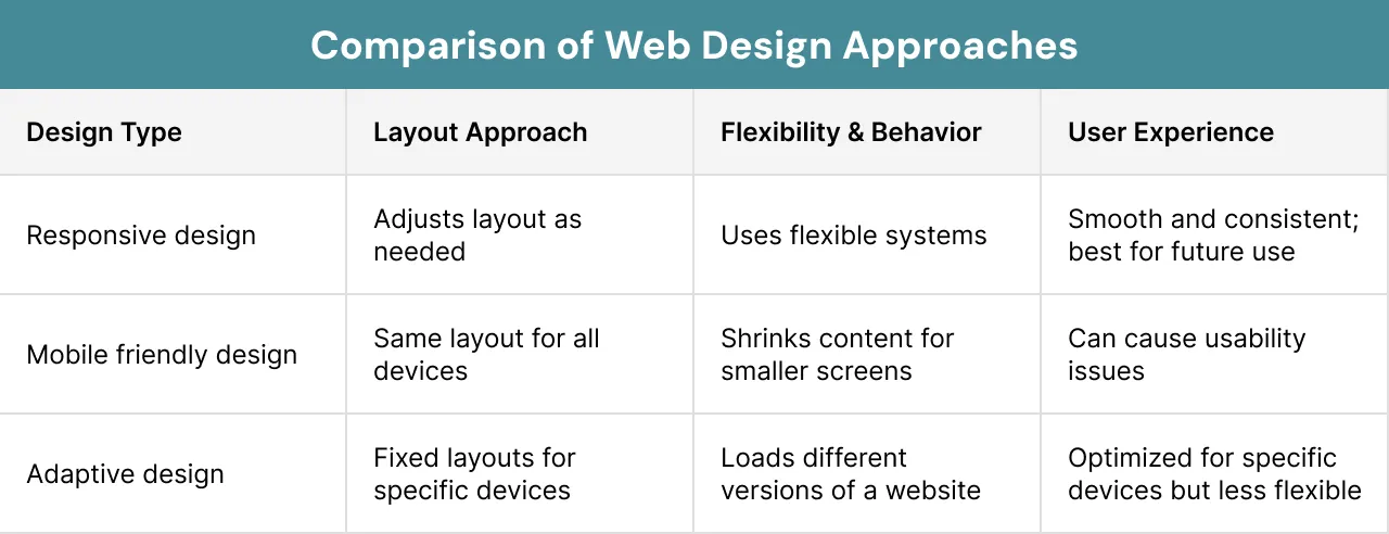
Flexbox for Flexible Layouts
Flexbox enables you to make designs that can adjust according to your screen size. It allows the content to fix properly and allocate space evenly.- Navigation bars
- Buttons and menus
- Arranging elements in rows or columns
CSS Grid for Complex Structures
CSS grid is used for complex layouts. You can make layouts with multiple columns that adapt to various screen sizes.- Full page layouts
- Image galleries
- Complex content parts
Responsive Typography With Clamp
The size of text also needs to change with screen size. The clamp() function helps text to change smoothly between minimum and maximum sizes.- Readability on small screens
- Visual balance on large screens
Viewport Units
Flexible units are used in modern responsive designs like:- vw (viewport width)
- vh (viewport height)
- rem (relative to root font size)
Container Queries
The newest feature in responsive web design services is container queries. They allow the elements to change according to the size of their container, not the entire screen. This makes designs more flexible and easy to use, especially for parts used again.How to Make Your Website Responsive?
Responsive designs are not just about layout adjustment as per screen size. Device orientation and aspect ratios are now used by modern approaches. These are important for improving user experience on mobile devices. Advanced responsive techniques include:Orientation Media Queries
Orientation media queries help you to apply styles based on the portrait or landscape mode of a device. This is helpful because users sometimes change the orientation of their devices. Some designs work best vertically but not horizontally. For example, you can adjust spacing, layouts change position of elements based on the orientation.
Aspect Ratio Media Queries
The focus of aspect ratio media queries is on the relationship between height and width of the screen. These ratios do not target a specific device, rather, they use the height and width of the viewport for layouts. These queries give more control, especially for heavy and complex media layouts. Example is:
- Keeping balanced layouts
- Improving readability
- Ensuring media are displayed correctly
How Does Responsive Web Design Affect User Experience?
RWD is not about changing things as per screen size. It also makes it easier for users to use. For example users navigate differently on various devices. So you need to make sure your design works well on all devices. User experience includes:Readability Across Devices
Responsive web pages help improve your user experience. A user can easily read text and move around pages when your site responds well.- Better readability with proper text sizing
- Simple menus for easy use
- Touch friendly buttons for mobile users
- Reduced need for zooming or scrolling sideways
Mobile vs Desktop Behaviour
Responsive web page design also looks at how people use various devices, such as:- Desktop users often scan content
- Mobile users prefer to scroll
What Content to Show on Your Website First?
Responsive web design is all about making content easy to find by the users. You must show the most important things first because smaller screens have less space. Prioritisation of content should be done by keeping in mind the following:What to Show First on Mobile Screens?
The following information should be displayed on mobile devices:- Key information
- Important calls to action
- Essential navigation
Removing Less Important Content
The less important parts must be hidden or removed, like extra images or side content. This avoids clutter on the screen.How to Use Navigation and Interaction on your Website?
Navigation must also adjust for different devices. A menu that works on a desktop may fail on a mobile screen. Different navigation patterns and interaction styles used include:Responsive Navigation Patterns
Basic patterns are:- Full menus on desktop
- Collapsed menus (hamburger menus) on mobile
Touch Friendly Design
Links and buttons should also be created for touch use. This means:- Making buttons big enough to tap
- Adding proper spacing between links
- Placing key elements within easy reach
How to Make Your Web Design Responsive and Accessible?
Performance and layout are not the issues that count while creating responsive web design. The site should be user friendly even to persons who may have different needs. The items below must be taken into consideration in order to make sure that the site is accessible.Making Websites Usable for Everyone
Users can access the content they want on any device. With a well designed website, every user can navigate it easily, read and utilize the content and features.Readable Fonts and Color Contrast
You should make the text easy to read on all screen sizes. This includes:- Using clear fonts
- Maintaining proper text size
- Ensuring strong colour contrast
Touch Targets and Keyboard Navigation
Interactive elements should be easy to use on all devices.- Making buttons large enough for touch
- Adding proper spacing between links
- Ensuring the website can be used with a keyboard
How to Improve Speed and Performance of Your Website?
Speed is an important element of responsive design. Slow loading sites can really annoy users and make them leave.Image Compression
The speed can be enhanced by:- Compressing images
- Using modern file types
Lazy Loading
It is a method where there is a delay in loading of images and videos. It loads when they are needed. All content does not load at once, rather it loads when users scroll to it.- Initial page loads fast
- Data usage is reduced
- Improved user experience
Efficient Media Delivery
Efficient media delivery is also important for responsive design. The media files should be optimised and delivered to fit the device and screen size of the user.- Using responsive image techniques like different image sizes
- Delivering smaller images for mobile devices
- Using modern formats for better compression
- Loading only the required media instead of everything at once
Reducing Scripts
This can be achieved by:- Reducing unnecessary scripts
- Making pages load more efficiently
How Responsive Web Design Impacts SEO?
Yes, responsive web design also impacts your SEO. It matters a lot for search engine optimisation. One clear reason is that Google mainly looks at the mobile version of a website when it judges how it should rank. Here is how it affects your website’s SEO:Mobile First Indexing
Google uses mobile first indexing, which means it looks at the mobile version of your website when ranking it.Core Web Vitals
In Core Web Vitals, responsive websites usually perform better. They measure:- Page load speed
- How fast users can interact
- How stable the page looks
Bounce Rate and Ranking Factors
There will be an increased bounce rate of your website if users leave quickly due to poor design. Search engines use this as a signal that your site may not be useful.- Keep users engaged
- Lower bounce rate
- Improve overall rankings
What Are the Common Mistakes in Responsive Web Design?
A well designed website can also fail if common mistakes are not avoided. The most common mistakes include:Fixed Width Layouts
Fixed layouts do not adjust to different screens. This causes content to overflow or become difficult to read on mobile devices.Ignoring Mobile Users
Designing mainly for desktop and adjusting later often leads to poor mobile experiences.Heavy Media Files
Large images and videos slow down your website. This affects both user experience and performance.Poor Navigation
Menus that work on desktop may not work on mobile. Overcrowded or confusing navigation can frustrate users.No Testing
Failing to test your website on different devices can cause broken layouts and usability issues.Hiding Important Content
Removing important content to simplify design can confuse users. Essential information should always be accessible.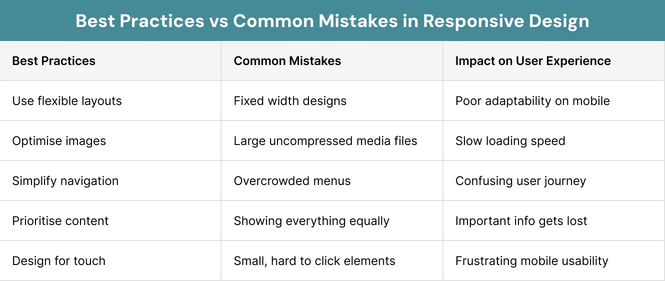
What Are the Best Practices for Responsive Web Design?
Here are some guidelines to follow when creating an effective responsive web design:Use Flexible Layouts
Do not use fixed width designs. Grids that fit the screen size must be used to make the content balanced and attractive.Optimise Images
Large images could affect the speed of your website. To improve speed:- Compress images
- Use modern formats
- Apply responsive sizing
Simplify Navigation
Navigation must be user friendly across all devices. On mobile:- Use drop down or hidden menus
- Reduce the number of options
- Focus on key actions
Prioritise Key Content
The important content needs to appear first. This is especially true for devices with small screens. You need to reduce extra items to avoid clutter.Design for Touch
Mobile users rely on touch. Make sure:- Buttons are large enough
- Links have space between them
- Interactive elements are easy to reach
Test Regularly
Testing is not a one time task. You need to check it often. This helps maintain good performance as devices and technology change.What Are Common Layout Patterns for Responsive Web Design?
Responsive web page designs use the common layout patterns to make websites easy to use on all devices. The most common responsive layout patterns are as follows:Content Stacking
Content stacking arranges the images and text on your website in a vertical order on small screens like phones. It makes your website easier to read and avoid cluttering.Multi Column to Single Column Layout
For better readability:- Desktop layouts often use multiple columns
- Mobile layouts use a single column
Card Based Design
The content is arranged into cards, which stack vertically on smaller screens. This keeps the layout clean and organised.Responsive Navigation Patterns
The navigation pattern is different for every device. It shows a full menu on your desktop and collapsed menu on your phone.How to Test a Responsive Website?
It is very important to build and then test a RWD. This is because it makes sure the website looks good and works properly on everything.- Real devices like phones, tablets and desktops
- Internet browsers
- Landscape and portrait screen views
- Different types of internet conditions
- When the website looks broken
- Buttons that are too small to press
- When the website takes too long to load
What Are Common Frameworks and Tools for Responsive Design?
It takes a lot of time and effort to build a responsive web page from scratch. This is where frameworks help. A framework is a ready made set of code, layouts and parts. It gives you a base to build a site more quickly.- Ready to use grid systems
- Predefined styles and elements
- Solutions for browser compatibility
- Faster development workflows
What Are the Types of Frameworks?
There are two main types of frameworks used in web development:- Grid systems for page layout
- Typography styles
- UI components like buttons and menus
- Database interactions
- User sessions
- Application logic
How To Make Websites with Responsiveness Website Builders?
Several platforms have built in responsive features. These platforms automatically adjust layouts, images and content to fit different devices.Design Tools
Design tools are used to plan layouts before building a website. They let teams make visual drafts for different screen sizes.- Making mobile and desktop layouts
- Planning user interface elements
- Sharing designs with developers
Development Tools
Developers also use tools to make websites more responsive and faster:- Wireframing tools to plan layouts
- Testing tools to check how websites look on different devices
- Plugins for responsive images and text
Simple vs Complete Frameworks
Frameworks can be classified based on their complexity. They can be simple or complete.Simple Frameworks
This type of framework is easy to use. They provide basic layout structure and focus on grid systems.Complete Frameworks
Complete frameworks are complete design systems. It has advanced features and components that provide you flexibility and customisationChoosing the Right Framework
The selection of the right framework is an important decision. You should think about several things:- Ease of installation and setup
- Level of complexity
- Available features and customisation options
- Integration with other tools
- Long term support and updates
- Popularity and community support
Common Examples of Responsive Web Design
Many well known companies use responsive web design to improve user experience. These examples show how content and layouts adjust based on the device type:Content Platforms
These use flexible grid layouts that change from multiple columns on desktop to a single column on mobile. This makes reading easier and reduces clutter.Service Websites
A service website is usually designed to make things quicker and easier on a phone. Instead of showing too many extra sections, it focuses on the main action, like signing up, booking or getting in touch.Ecommerce Platforms
Online stores are built to show products clearly and make browsing simple. On phones, they often reduce menu items and clean up the layout so people can find what they want faster and shop without confusion.Technology Platforms
Some websites change their layout and content depending on the device being used. Buttons, sections and even the way information appears may be adjusted to better suit mobile or desktop users, making the experience feel more relevant and easier to use.How to Measure Success of Your Website Design?
The effectiveness of your responsive web design should be monitored by using metrics.- Page load speed
- Bounce rate
- Mobile vs desktop traffic
- Conversion rates
Analysing User Behaviour
Numbers are not sufficient. You should look at what users do on your website.- Where users click
- How far they scroll
- Which elements they ignore
- These tools can help you make your web design better.
Continuous Improvement
It is not a one time task to make responsive web design. There is still a need for regular updates and improvements.- You should keep monitoring performance regularly
- You should keep testing new features
- You should keep adapting to user behaviour
What Is the Future of Responsive Web Design?
The responsive web design services keep changing as more devices arise. You can see the changes in the following areas:Designing for Foldable and New Devices
New devices need more flexible layouts, like foldable phones and large screen tablets.Role of Artificial Intelligence in Design
AI can be helpful in creating a better layout. It can help you achieve quicker and more effective responsive web design.This can be:- Suggesting improvements
- Automating testing
- Customising content
Personalisation and Adaptive Experiences
Personalised experiences are now more common. Many modern websites are using them. Content can change based on:- User behaviour
- Location
- Device type
What Is the Impact of Responsive Design?
Responsive web design is directly linked to business outcomes. A good responsive website builds trust and encourages users to act.- Increase user engagement
- Improve customer satisfaction
- Boost conversions
- Strengthen brand credibility
Case Study
This case study is about responsive transformation of the BBC News website in the UK. It is one of the earliest and most important examples of responsive web design.Final Thoughts
Responsive web design is not optional anymore in 2026, it is the need of the hour. It is an important part of a successful website.- Ease of use
- Simple development
- Long term success
- Content quality
- Strong user experience
- Performance
- Ongoing improvement
Struggling to make your website fully responsive across all devices?
FAQs
Is web design still in demand in 2026?
The biggest marketing challenges in 2026 include tight budgets disconnected from revenue, poor lead quality from wrong channels, AI adoption without brand strategy, ad fatigue, data privacy shifts, unprovable ROI, sales-marketing misalignment, short-form video pressure and sustainability expectations.
Why is responsive web design essential for modern websites?
The marketing challenges for FMCG brands centre on content saturation, rising ad costs, reduced targeting precision after cookie deprecation, sustainability expectations and audiences whose priorities shift faster than quarterly planning cycles.
What is the importance of responsive web design?
What happens if a website is not responsive?
The marketing challenges in service business settings are distinct because the product is intangible. Harder to differentiate, harder to convert without first building trust. Specific client outcomes and storytelling consistently outperform feature-based messaging.