- March 27, 2026
- Categories: Web Solutions
Essential Website Design Tips for a User-Friendly Experience
Have you ever wondered why some websites get sales in seconds while others lose users so quickly?
Research says that about 57% of visitors will not recommend a business if its site has a poor design. This report shows the importance of website design for the growth and trust of a business. People will leave your page if it feels bad or is hard to use. They will search for another one quickly.
If users find that the design of the website is strong, they will easily find what they need. The site visit will be enjoyable for people, so taking action will be helpful for them.
Design is not just about how it appears. It helps your site run steadily and achieve your objectives.
Whether you create a new website or change an old one, small modifications can have a big impact. A fast, simple site keeps readers on your page and makes them interested in your content. A skilled website designer can also help you make these updates.
This blog will help you learn:
- Main website design tips for a user-friendly site
- Ways to make your site simple and understandable
- Ways to boost your site’s flow, layout and speed
- How to increase user actions and get better results
- Procedures to make your site perform well on desktop and mobile
What Is a Website Design?
Website design means setting up and creating a website. It involves the framework, visuals, fonts, colours and its look.
The main thing is to construct a site that feels good and is easy to use. Its layout should be such that visitors find what they need quickly and don’t get bored during the visit.
Design reflects the site’s performance and looks. This keeps your site running smoothly, looking clear and convenient to use on any screen. A well-crafted site keeps both looks and usefulness in balance.
Discover more: Website design tips
Top Website Design Tips for a Great Website
If you want a great site, don’t pay attention only to how it appears. Also, focus on how fast readers can interact with your site and how simple it is to use. If your site is slow or hard to use, visitors will quickly go to another one.
I have collected easy website design tips to make sure a smooth experience. These website design tips will help you create a site that will perform well and not lose visitors.
1. Keep Your Homepage Easy in Your Website Design
When someone opens the website, your homepage should show the main content at once. Most people do not read your site word by word. They just visit your page to scan it.
So, you should make your site tidy and simple. Excess graphics or text can irritate and confuse visitors.
Don’t forget these tips to keep your homepage simple and convenient to use:
- The main content must be at the top so visitors can explore it quickly
- To make the page feel wide and clear, utilise space
- Show your message with a quality image
- Include a clear CTA, for example, “book an appointment” or “make a purchase now”
2. Use a Clear Visual Hierarchy
With the help of visuals, people find it easy to know where to go first. It is very helpful in performing actions step by step. While building a site, make the main parts prominent so that users do not miss them.
The considerations given below help create a clear structure that makes your site easy to use and follow:
- Keep the related items in a group to keep them neat
- Grab attention with the use of contrast and colour
- For ease of use, place important buttons in the right places
- Write titles in large and bold font
3. Make Content Understandable in Your Website Design
Visitors will leave your page quickly if your content is not understandable. So, make your text easy to read, simple and clear. Content written this way is helpful for keeping users on your site longer. They scan clear text in no time. Keep these points in mind:- To write text on your site, choose a font that is easy to read
- Select simple fonts and do not choose stylish ones
- It’s good practice to keep a good contrast between the background and text
- Keep the sentences and sections short
4. Make Your Website Easy to Navigate
Readers should search for what they require in just a few clicks. They may leave if they can’t get what they need immediately.
Make sure all links and menus are understandable and usable. Keep these points in mind for good navigation, which helps flow and SEO:
- The naming of the menu must be clear and simple
- The menu must be easy to use
- Keep your logo linked to the homepage
- Add search and navigational links to help users move easily around the website
- Put important links in the footer
5. Keep Website Design Mobile Friendly
Most people visit your website on their phone. So, you should build your site to work well on all screens. A mobile-friendly page keeps visitors engaged and stops them from going on other pages.
A smooth mobile view is now necessary, not a choice. Let’s look at some necessary points:
- Check your website on different devices
- The look should be simple and clean
- There should be buttons that are easy to tap
- Without zooming, the text should be easy to read
6. Keep Website Design Steady
If you keep everything consistent on your website, it will create trust and make it feel clear. Across all pages of the site, people should see the same style. A uniform design provides an easy to use and professional look if:- Fonts use the same colours
- Style of the images is the same
- Fixed structure and spacing used
- Buttons and forms have the same style
7. Choose a Simple Layout
If the layout of the page is complex, it will confuse visitors and reduce results.
Keep your design consistent and simple for important activities. The following points help keep the layout simple, which is useful for users to take action quickly:
- Don’t use too many effects or pop-ups
- Feature main actions and sections
- Reduce the number of choices to give instructions to users more clearly
- Keep the content clean by using a grid layout
8. Add a Clear Call to Action
People look for clear steps to follow. So, a powerful call to action (CTA) will guide them well. If they do not find it, they may leave the site without performing any action.
If the actions are clear, it will convert the visitors into buyers or leads. Keep the following tips in mind that will help in adding a strong call to action:
- For better focus, use contrasting colours
- Around buttons, add space to make them highly noticeable
- Buttons should be in a place where visitors can see them easily
- CTA should use words like “get a quote” or “start now”
9. Enhance Speed and Performance in Your Website Design
If the site is slow, it results in a high bounce rate. Users expect a quick loading time. Even if the delay occurs for a few seconds, this leads visitors to leave the page.
A fast website keeps visitors engaged and gives good results. Thus:
- Compress pictures to make their size smaller
- Get rid of plugins that are not used
- Choose light and clean design components
10. Make Website Design Easy to Use for All Users
The design of the website should be such that it works for everyone. It also includes users with special needs. If the access is good, it will improve trust and reach.
An accessible site helps users and builds trust. Let’s look at the following points:
- Check your site to see if it is easy to use or not
- Build it in a way that it supports keyboard use
- Include alt text for illustrations
- Choose clear text and powerful contrast
11. Properly Use Space and Images in Your Website Design
With the help of white space, visitors pay attention to what is important. Add images in a way that supports your content. It must not make it slow.
Use white space properly to make your page clear and understandable. Remember these points to utilise white space well:
- Don’t put too many images on one page
- While adding visuals, make sure they are high quality and to the point
- After every section, take a break to achieve clarity
12. Add Clear Info and Build Trust
People always trust websites that are easy to check and use. Its design should ensure that the main information is easy to find. Users feel secure and they are more willing to take action if trust is built. To create trust:- Your brand style should be consistent and clear
- Reviews or feedback from users should be clearly shown on the page
- Include contact info on all pages
13. Test and Improve Website Design Frequently
When you build a website and complete all its steps, it is never actually finished. Over time, you must test and improve it. People’s needs change over time. Your website should adjust to these modifications.
If you keep your site up to date, this will keep it useful and fresh. The following tips will be helpful in this regard:
- According to the results, make updates to your design
- When people visit your site, ask for feedback
- With the help of A/B testing, test changes
- Use tools to track visitors’ behaviour
Understanding effective website design trends help building a website where users stay for long.
What Are Website Design Requirements?
Website design requirements are a guide for how your page should look, feel and work. These requirements show how to plan and build the site.
These must-haves make sure your site meets its objectives, fits your users’ expectations and works well on all devices. The main parts of website design requirements are explained below:
1. Objective and Purpose
Work out the purpose of your site and start with a clear goal. Clearly define your target audience and what you expect them to do, like “learn”, “sign up” or “buy”.2. User Profiles
Build simple user profiles. This helps you understand who will use your website. They are very helpful in understanding user demands, habits and what they look for.3. Features and Functions
Write down what your website must do. This includes search, online shop, forms or login. These features increase the chances that users will take action.4. Website Performance and Usability
Your site should be easy to use, secure and quick. It should not take too much time to load, perform well and be easy to use for all visitors. This also includes those with special needs.
The loading speed of websites has a high impact on sales and conversions. It’s necessary to keep the loading speed fast.
5. Content Plan
Determine what content your site will have. This includes videos, visuals, text and other parts. You should keep it clear and helpful for visitors.6. Visual Style
Decide on the appearance of your website. You should select layout, graphics, colours and fonts that correspond to your brand and feel clear and consistent.7. Technical Setup
Think of a plan for how your website will be built. This plan covers code, tools and how it will appear on all devices and browsers.8. Testing and Launching
Before making your website go live, test it properly. All the features, links and pages of the site should be checked to ensure that they perform well.9. Updates and Maintenance
When you make a website, you must update it often. Over time, keep your site safe, update content and fix mistakes.10. Track Results
Use different methods to monitor how your website performs. For this, you can use data like clicks, visits and actions to ensure that your website meets its goals. A skilled website designer doesn’t ignore these steps when building a strong site.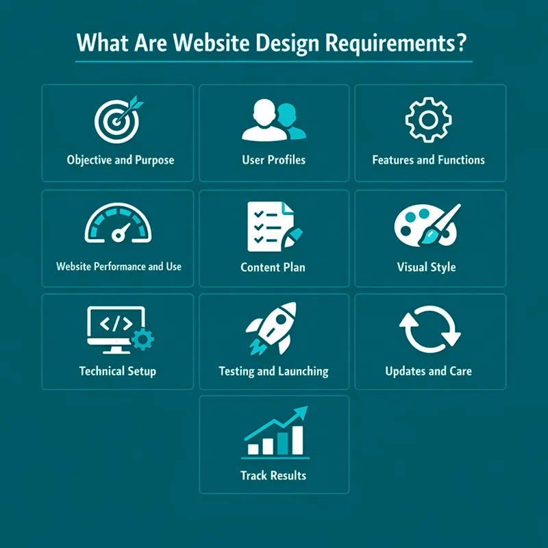
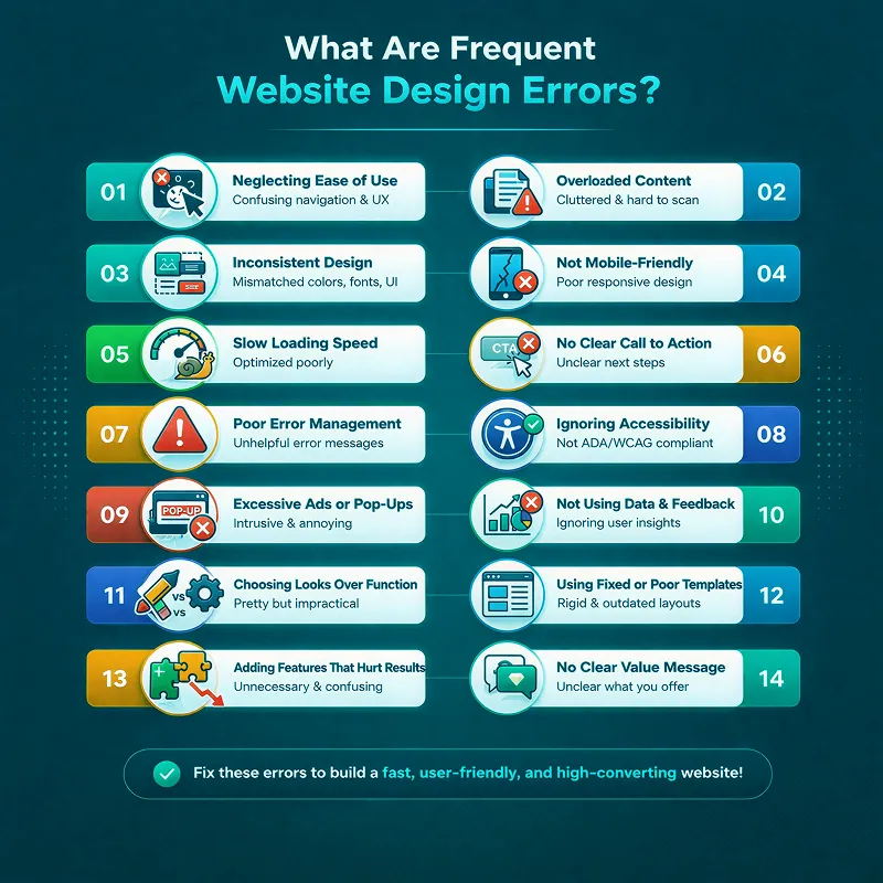
What Are Frequent Website Design Errors?
No matter how good a website looks, if it is not easy to use, it will fail. Due to basic design mistakes, most sites end up losing users.
To make a website easy and smooth to use, don’t ignore these common problems:
1. Neglecting Website Design Ease of Use
Most websites ignore that they should be easy to use and pay attention only to looks. Make your site clear, simple and easy to move around. It should not be made so that users feel lost or confused.2. Overloaded Content
If your site has too much rushed content, it can irritate users. Your website content should be clear, short and spaced well. With this strategy, users will read and understand quickly.3. Inconsistent Website Design
Using a lot of different styles, fonts or colours on your site can make it look messy. Keeping a consistent and clear design on all pages helps build trust and a powerful brand.4. Not Mobile-Friendly Website Design
Nowadays, most people use their phones to search online. So, if your site is not mobile-friendly, users may go to another site without reading it.
Build your website so it performs well on all screen sizes. It should also be simple to use on small screens.
5. Slow Loading Speed
If your website speed is slow, it can annoy visitors and make them leave. Keep your site fast by compressing images and cutting down large files.6. No Clear Call to Action
If you don’t include a clear CTA, users won’t understand what to do next. This may make them leave your page.
Place clear buttons where visitors can see them easily. For example, “sign up”, “buy now” or similar.
7. Poor Error Management
Users get confused if they do not see a clear message when an issue occurs. If an error happens, show a clear message and tell readers what to do next.8. Ignoring Accessibility
You should make a website in a way that is helpful for all users. It also includes users with special needs. So, include alt text for images, allow keyboard use, use powerful contrast and keep text clear.9. Excessive Ads or Pop-Ups
Using too many ads or pop-ups can irritate users and spoil their experience. So, restrict ads and pop-ups to avoid breaking the user’s experience.10. Not Using Data and Feedback
You cannot improve your website if you do not monitor visitor behaviour. For this purpose, you must use tools to track user interactions and keep your site up to date based on real data.11. Choosing Looks Over Function
Don’t focus so much on a nice design that you make your website hard to use. It should be made in a way that supports users and does not block them.12. Using Fixed or Poor Templates
If you use basic templates for your website, this will limit your site because it will look like others. A custom and flexible design helps you become more noticeable and grow.13. Adding Features That Hurt Results
If you use too many features, it will confuse visitors and reduce results.
To prevent this, avoid:
- Hard checkout steps
- Complex menus
- Poor content
- Auto-play videos
- Slow load speed
- Long or hard forms
- Too many pop-ups
14. No Clear Value Message
Users will leave your site if they do not understand what makes you different. Use simple graphics and clear words to show your value. Pay attention to user problems and needs.
A weak website about design often includes these mistakes.
Real Life Example: Website Design for a Digital Marketing Agency in the UK
Every business must have a strong online presence in today’s digital world. For a digital marketing agency, this matters even more.
A UK agency came to us for the design of its site. They wanted to make their website better to showcase their skills and get more clients.
The Challenge
Their old website had many issues. Here are some major ones:- The design was not appealing and it looked outdated
- The pages were so hard to use and users didn’t show any interest
- There was no CTA, so users were finding it difficult to contact them
- Their site needed improvements in the hosting system and email tools
The Solution
After redesigning the full website, it got a fresh look and became up to date. The following updates were brought to it:- Bold designs were added with a clean structure
- Strong graphics and large fonts were used
- To make it easy to use, navigation was enhanced
- Its loading speed was increased to make it smoother
The Results
When the updates were done to the website, it showed many improvements, such as:- Users started to stay on the page for longer
- Bounce rates decreased
- More people tried to get in touch with the agency
- Its speed increased
Final Thoughts
If you want to create a user-friendly website, looks are not the only thing to focus on. You must consider many other things, such as simple design, clear flow and ease of use on all devices.
By focusing on user needs, fast speed and clean layout, you can create a site that keeps the audience engaged. It also helps them take action. You can make a big difference over time with user feedback, regular tests and small changes.
Web design is not fixed, but it is changing constantly. To stand out, you must be consistent in improving your site with all updates. You should design it according to user expectations.
Xoom Plus understands how user experience, function and design matter for your growth. Our team builds custom websites that deliver real results and are clear and simple.
Contact us today to create a website that helps your business grow and is easy to use.
Struggling to keep visitors on your site and boost conversions?
We have helped businesses improve engagement and sales with effective website design. Reach out today to get a clear, user-friendly site that drives results.
FAQs
What are some essential website tips for creating a user-friendly site?
Some essential website design tips include keeping your homepage clean, using clear navigation, optimising loading speed, making content easy to read, and ensuring mobile-friendliness. These steps help keep visitors engaged and increase conversions.
What are the best ecommerce website design tips to boost sales?
Effective ecommerce website design tips include having a simple layout, clear calls to action, fast page speed, mobile-friendly design, and trust signals like reviews. Following these tips improves user experience and encourages customers to buy.
How can I make my website design more user-friendly?
Focus on simple layouts, clear navigation, readable text, and fast-loading pages. Test your site on different devices and update regularly to keep the experience smooth for all visitors.
Why is mobile-friendly design important for websites?
Most users visit sites on phones or tablets. A mobile-friendly design ensures your pages look good, load fast, and are easy to use on any screen, keeping visitors engaged.
What common mistakes should I avoid in website design?
Avoid cluttered pages, slow loading speed, inconsistent styles, missing CTAs, and too many pop-ups. Keeping your site simple and clear improves trust, engagement, and conversions.