- December 15, 2025
- Categories: Graphic Design Solutions
Common Graphic Design Mistakes to Avoid
A Lucidpress study found that consistent branding can increase revenue by up to 33%. One small design slip can undo that entire advantage in seconds. A mismatched font, a button nobody notices or text that nobody can read and a brilliant idea suddenly looks amateur.
Graphic design mistakes are easy to make and costly to ignore. They can cost you your sales and audience’s trust. They can even turn a serious brand message into one of those funny graphic design mistakes people screenshot and share online. This guide walks through the most common graphic design fails and shows exactly how to fix each one.
Key Takeaways
- Small design errors, from font clutter to poor colour contrast, can seriously damage how professional a brand looks
- Visual hierarchy and white space guide the reader’s eye and directly affect how easily a message lands
- Choosing the right colour mode and resolution for print versus screen prevents costly output errors
- Consistent branding across every platform builds recognition and, according to research, measurably increases revenue
- Even experienced designers fall into traps such as ignoring accessibility, overcomplicating layouts or skipping mobile testing
Ten Common Graphic Design Mistakes to Avoid
As graphic designer Paul Rand once put it,‘Simplicity is not the goal itself. It is the by-product of a good idea and modest expectations.’
That idea runs through almost every mistake below. Here are the graphic design mistakes to avoid and pay attention to.
1. Using Too Many Fonts
It is not a problem if you use a fancy or a simple font since they give a design personality. The issue starts when several fonts appear at once. Each font carries its own style and mixing them this way is one of the major graphic design mistakes.
A poster using five different fonts will look messy even with strong content behind it. The safer approach is one font for headings and another for body text, with a third reserved only for small accents. Features like bold, italics, capitals and size changes can add variation without creating clutter.
A leaflet using Comic Sans for the title, Times New Roman for the body and Impact for emphasis looks messy and amateurish. A better fix pairs two fonts that really work together, such as Montserrat for titles and Georgia for body text.
2. Unclear Hierarchy
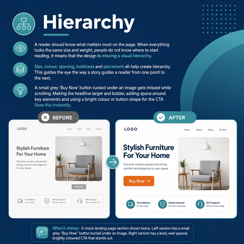
A reader should know what matters most on the page. When everything looks the same size and weight, people do not know where to start reading; it means that the design is missing a visual hierarchy. In that case, a headline or call to action can easily go unnoticed. Size, colour, spacing, boldness and placement all help create hierarchy. This guides the eye the way a story guides a reader from one point to the next.
A small grey ‘Buy Now’ button tucked under an image gets missed while scrolling. Making the headline larger and bolder, adding space around key elements and using a bright colour or button shape for the CTA fixes this instantly.
3. Ignoring White Space
The empty area around the content is called white space or negative space. Some designers treat it as wasted space and try to fill every inch with images and text. This creates visual stress rather than clarity. In reality, white space gives a design room to breathe and content becomes easier to read because of it.
A crammed product flyer with no space between photos, logos and text feels overwhelming. Adding space around headings, graphics and borders lets the important features stand out properly. Such graphic design mistakes may sound minor but can lead to losses.
4. Overusing Effects
Drop shadows, bevels, outlines and filters can be fun. But using a lot of them makes a design feel dated rather than polished. These effects were popular in the early 2000s. Today they read as clutter unless used with real purpose.
A business card with bright rainbow text and thick shadows looks flashy but is hard to read and lacks the expert touch. Using soft shadows sparingly or a light filter to set a mood keeps the design modern and clean unless a brand specifically calls for a bold or vintage look.
5. Poor Colour Choices
Colour carries real weight since it shapes both message and mood. Poor combinations make a design hard to read or send the wrong impression. Some colours lack contrast, while others clash so sharply that they strain the eye. Brand colours should also stay recognisable and accessible to everyone, including people with visual impairments.
Light yellow text on a white background looks soft but is nearly impossible to read. Choosing pairs that contrast properly, such as blue with white or dark green with beige, solves this. Free tools such as WebAIM’s Contrast Checker help confirm this. WCAG 2.2 AA recommends a contrast ratio of at least 4.5:1 for normal-sized text. Tools like WebAIM’s Contrast Checker can help you test your colours.
6. Using Wrong Medium
Screens and print have different technical needs. Digital design is defined by pixel dimensions, not DPI. Print is different since it’s a physical medium, so resolution matters and is measured in PPI, with 300 PPI being a safe standard for most print like business cards.
A business card designed with too few pixels looks sharp on screen but turns pixelated once printed, since there aren’t enough pixels to fill the page at a high enough density. Setting a high pixel count from the start, switching to CMYK, and using at least 300 PPI at final print size helps avoid this.
7. Erratic Branding
A brand should be familiar the moment someone sees it, whether it is on a business card, website or advert. Mixing fonts, colours or logo versions across platforms breaks that recognition. Following a single brand style guide across every design keeps the voice clear and consistent.
Packaging using a modern serif font and a black and white logo, paired with a bright pink, bubbly Instagram feed sends two different brand identities at once. Locking in one font system, colour palette and logo version across every channel fixes this.
8. Ignoring Readability
If a message is hard to read, then people leave before they even absorb it. Small font sizes and poor contrast are common culprits and the problem shows up most on mobile screens, where space is already tight. A design should stay easy to read even from a distance or on a small screen.
Grey text on a white background looks fine on a large monitor but becomes unreadable on a phone. Testing across multiple devices catches this before it reaches an audience.
9. Using Low Quality Images
A strong design can be undone entirely by a poor image. Low-resolution or warped photos damage credibility and the flaws become even more visible in print, where every detail shows. High-resolution files, along with vector formats for logos and graphics, avoid this problem completely.
A tiny image taken from Google and printed on a flyer comes out grainy and rushed-looking. Using original high-resolution or royalty-free images and SVG or PDF files for logos prevents this.
10. Not Proofreading
Design is not just visuals. Typos, misspellings and grammar errors can damage a brand’s repute just as quickly as a visual mistake and once a reader spots one error, trust drops fast. Careful review, ideally by someone other than the designer, before publishing or printing catches most of these issues early.Advanced Graphic Design Mistakes
Experience does not make anyone immune to these mistakes. A few graphic design mistakes show up even among seasoned experts.1. Not Getting the Client Brief
Diving into design before fully knowing the goal, audience or tone leads to work that looks beautiful but misses the point entirely. Knowing what needs to be done before opening any design software saves a huge amount of revision time later.2. Copycatting
Inspiration is healthy and often needed, but copying a design too closely risks both legal trouble and repute. Reinterpreting an idea through a brand’s own identity helps avoid this. Short-term mimicry is one of the graphic design mistakes that rarely holds long-term value.3. Forgetting Accessibility Guidelines
Ignoring text contrast, touch target size or alt text shuts out users with visual impairments. Following WCAG accessibility guidelines improves the experience for every user, not only those who need it most.4. Relying Too Heavily on Trends
Among the advanced graphic design mistakes, following Trends is quite common. Trends make a design feel current for a while, but leaning on them too much makes work feel generic once the trend fades. Using trends as light inspiration, rather than the core of a design, keeps a brand’s core identity intact.5. Making Complex Layouts
Cramming too many elements into one design overwhelms the reader and dilutes the message. Clean and simple layouts with room to breathe tend to convert better than those full of features.6. Failing to Optimise for Mobile
A design that looks perfect on a laptop can fall apart on a phone. It could be overlapping elements, tiny fonts or unreadable buttons. Testing responsiveness before launch is no longer a choice, as much of the traffic now comes from mobile devices.7. Improper Export Settings
Among all the other graphic design mistakes, this one can cost you a lot of your time. Exporting in the wrong format or resolution can ruin even a strong design. JPEGs can blur logos, oversized PNGs slow load times and the wrong choice of SVG, PNG or PDF depends entirely on where the file will be used. Double-checking resolution and compression before delivery avoids sloppy output.
Pro Tip:
Keep a short pre-delivery checklist covering file format, resolution, colour mode and proofreading. Running through it before every handoff catches most of these mistakes before a client ever sees them.
Case Study: How Tropicana Lost $30 Million to a One of the Graphic Design Mistakes
In January 2009, Tropicana redesigned the packaging for its best-selling orange juice. The new look swapped out its famous orange-with-a-straw image for a plain glass of juice and a generic logo.
The design itself wasn’t bad. It just broke the visual cues shoppers used to spot it on the shelf. People scanning for the familiar orange couldn’t find it, and some thought the brand had been replaced by a store-brand lookalike.
Sales dropped 20% in two months, costing Tropicana about $30 million. By late February, the company scrapped the new design and brought back the original.
It’s a clear example of what this guide has covered throughout. Erratic branding and unclear hierarchy don’t just look off; they can break the recognition a brand relies on. Tropicana’s case is still taught in design courses today as proof that even a well-made redesign can fail if it ignores how people actually use a design in real life.
Conclusion
Good design does not happen by accident. It comes from careful choices made along the way. These could be the right font pairing, enough breathing room around your content, a colour combination that actually works for everyone reading it. None of the mistakes in this guide is complicated once you know what to look for. A font clash, a buried button, low-contrast text these are easy things to miss when you are moving fast. But just as easy to fix once you catch these graphic design mistakes.
The real difference between a design that looks professional and one that quietly undermines itself often comes down to a handful of small details like these. Catching them early saves time. It also protects your brand and keeps your audience trusting what they see.
Not every business has the time to catch every one of these graphic design mistakes on their own and that is exactly the gap XoomPlus fills. The experts at XoomPlus spot what gets missed and turn it into a design that works the first time.
Tired of design mistakes costing you clients and credibility?
Get in touch with XoomPlus today and let our team build designs that look polished the first time.
FAQs
The most common mistakes include using too many fonts, poor visual hierarchy, ignoring white space, overusing effects, wrong colour choices, designing for the wrong medium, inconsistent branding, neglecting readability, low-quality images and skipping proofreading.
Even experienced designers can misunderstand a client brief, lean too heavily on trends, overcomplicate layouts, forget accessibility guidelines or fail to test designs on mobile before launch.
Start with a simple checklist covering fonts, colour contrast, resolution and proofreading, and test every design across different screen sizes before finalising it.
Poor contrast makes text harder to read and can create barriers for users with visual impairments. Under WCAG AA, normal-sized text should have a contrast ratio of at least 4.5:1, while large text requires at least 3:1.
Screen designs typically use RGB colour and are created based on pixel dimensions rather than a fixed DPI. Print designs generally use CMYK colour and higher-resolution images, often around 300 DPI, to produce sharp, high-quality results.